I have been working with a team of Brazilian artists on a new design for Relio.com
I mentioned it in past posts on my blog, today, after more than 8 months, the site is finally up, both the US and UK sections of it
I was ecstatic when I put it LIVE, this is the best site I worked on to date, but it’s risky, and not everybody will like it, but I love it, and the type of clients Relio attracts will surely love it as well
Actually, I just got an email back from a client commending on the new site 🙂
Technorati Tags: WebHosting, Relio
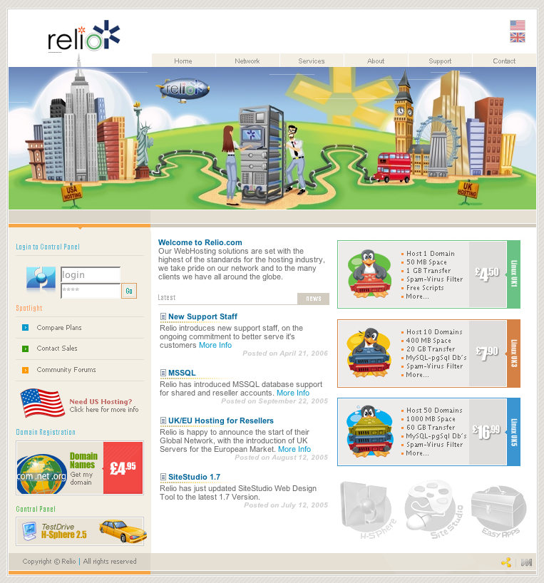
The data travelling throught the cables looks sweet. I suppose the size of the globe will increase as Relio expands to other countries. 😉
I like the shiny new look.
Sweeeeet! 🙂 Something different but nice!
Andrew
Yes, eventually Relio will have a presence in Australia and Singapore or HK
Then the Globe will grow 🙂
Expanding services globally sounds great!
New site looks truley amazing – excellent branding, great look and feel, and clean presentation of data.
Congrats!
Thanks 🙂
I really like the site also. It’s a refreshing break away from the typically lame designed hosting sites making use of corny stock imagery e.g. (globes, wires, routers, servers, goofy handshakes, etc.) and really evokes some cool feelings. It suits your brand well.
Thanks Mason
I recently saw on webhostingtalk.com somebody asking for a designer to create a site with similar animation to relio.com .. I was quite happy, after all, if people are trying to copy you, it’s a compliment, but then the person said their budget was $60 USD ..
jeez 🙂
nice layout 🙂